#195 que quieres decir con mundana? no lo asocio con lo que pone en la rae 
ARTE
OFERTASVer todas
-
-11%Focusrite Scarlett 8i6 3rd Gen
-
-40%Roland SPD-20 Pro BK Octapad
-
-48%Behringer Powerplay P16-M Personal Mixer

Hay que tener registros para dedicarse al arte, me refiero a lo que cualquiera entiende: menos ñoña, más en el mundo, como expresa la palabra, menos mística, más socializada, más divertida y con una sensibilidad y una sensualidad más propia del metal brillante que de la roca atormentada.
#198
Aclaración, escribe aclaramiento y serás el hazmereir de la crítica y la clientela: la era de los artistas-de las montañas está caducada, un escultor-pastor, una especie de Miguel Hernández de la forma metálica no creo que fuese tenido muy en cuenta; el arte contemporáneo exige al autor una complicidad con la crítica enorme, el arte contemporáneo es despiadadamente exigente con lo culto, no se pide erudición (que a un arquitecto casi sí); se exigen registros, no puede haber arte contemporáneo inculto o patán, no sólo tienes que crear, tienes que expresarte en unas claves cultas con tu audiencia.
Esta es un de las razones por las que el arte de las vanguardias y el actual no son populares casi nunca, ni el action painting, ni siquiera el Pop art lo fue.
Púlete.
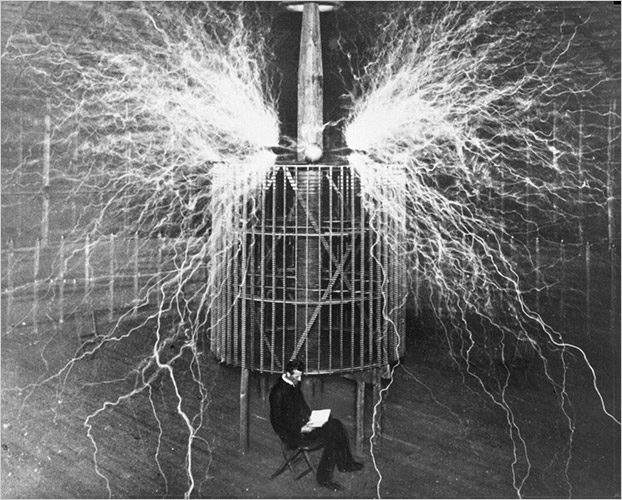
Nikola Tesla appears in a multiple-exposure photo in 1899, while a Tesla coil discharges millions of volts.
http://www.openculture.com/2014/03/an-electric-photo-of-nikola-tesla-1899.html
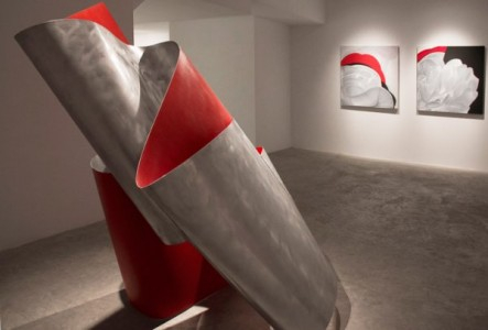
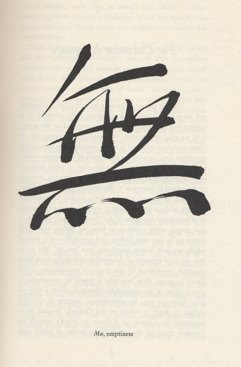
Sisu escribió:En este caso es un trabajo para la uni, claramente inspirado por Oteiza intento captar el vacio de la misma manera que lo hacen sus obras, aunque a diferencia de él mi intención es que la forma del envolvente de la figura no quede materializada.
Aunque no tiene nada que ver me he acordado de esto que hace un amigo.
http://www.lasprovincias.es/v/20120211/culturas/nadal-demonios-polvo-20120211.html
El día que tenga una casa más grande creo que me haré con alguna de las pinturas, tienen un punto orgánico que me encanta.
http://issuu.com/jcnadal/docs/nadal__dust_devil_
Contraportada del libro de Banksy con cita de la Metropolitan Police... pic.twitter.com/vgQgU4UQRL
Visto en el Twitter de eDans
Visto en el Twitter de eDans
 20.55.18.png")
Si el resto del libro está a la altura de la contraportada seguro que merece la pena...
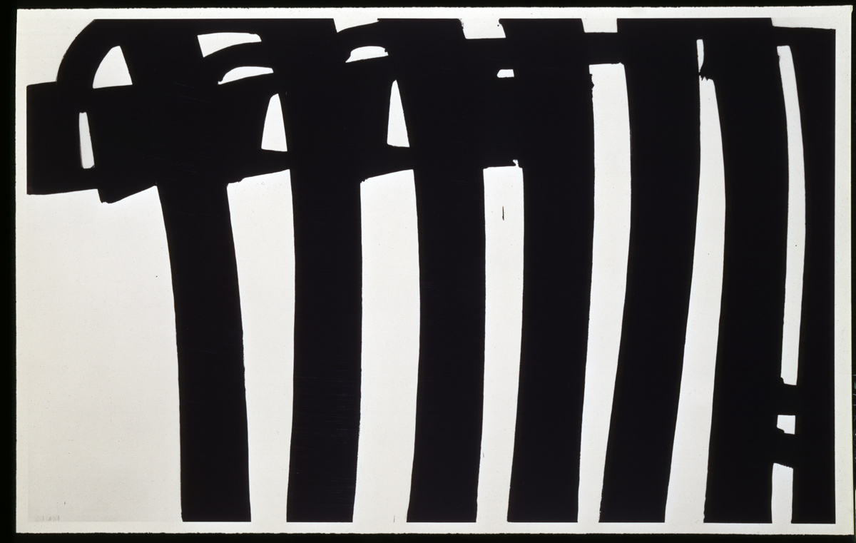
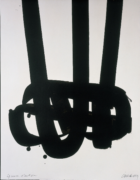
Sisu escribió:PD: conoces a Pierre Soulages?
Había visto alguna cosa pero no lo conocía. Muy interesante, supongo que será una influencia de Juan Carlos... vistas algunas pinturas tiene cierto rollo de caligrafía japonesa, ¿no?.
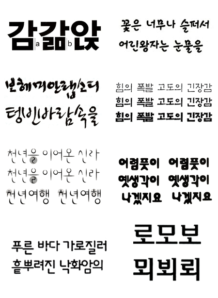
Y hablando de caligrafía, me fascina la coreana... a diferencia del kanji u otros sistemas asiáticos la caligrafía coreana es inventada
[ Imagen no disponible ]
[ Imagen no disponible ]
http://en.wikipedia.org/wiki/Hangul
klausmaria escribió:Y hablando de caligrafía, me fascina la coreana... a diferencia del kanji u otros sistemas asiáticos la caligrafía coreana es inventada fue diseñada y eso le da un punto racional muy curioso que se plasma en el diseño de tipografías. Fijaos en lo sistemático de la
Tenéis mejor info aquí:
Alguien escribió:Hangul 101
Hangul has only five elements: dots, vertical strokes, horizontal strokes, diagonal strokes and circles. It consists of 51 jamo, or phomenic units.
Consonants are linear shapes (ㄱ, ㄴ, ㄷ, ㄹ, ㅁ, ㅂ, ㅅ, ㅇ, ㅈ, ㅊ, ㅋ, ㅌ, ㅍ, ㅎ), vowels are lines (ㅏ, ㅐ, ㅑ, ㅒ, ㅓ, ㅔ, ㅕ, ㅖ, ㅗ, ㅘ, ㅙ, ㅚ, ㅛ, ㅜ, ㅝ, ㅞ, ㅟ, ㅠ, ㅡ, ㅢ, ㅣ), and a few consonants are doubled (ㄲ, ㄸ, ㅃ, ㅆ, ㅉ) to create glottalized letters.
The most interesting aspect of Hangul is that the letters were each designed for a special purpose. The consenants are designed to symbolize the different position of the mouth and tongue when pronounced.
The symbol ‘ㄴ’ [n] depicts the shape of
the tongue touching the upper palate.
The symbol ‘ㅁ’ [m] depicts the outline
of the mouth.
The symbol ‘ㄱ’ [k/g] depicts the shape
of the back of the tongue blocking the
throat.
The vowels, on the other hand are composed of three elements of nature: humans, earth and heaven. Vertical strokes signify humans, horizontal strokes are the earth, and the dots represent heaven.
http://themetaq.com/articles/korean-typography
No se si es arte, pero me parece fascinante.
Nuevo post
Regístrate o identifícate para poder postear en este hilo